SERVICES - HAND LETTERED LOGO / SIGNAGE / SOCIAL MEDIA / MERCH
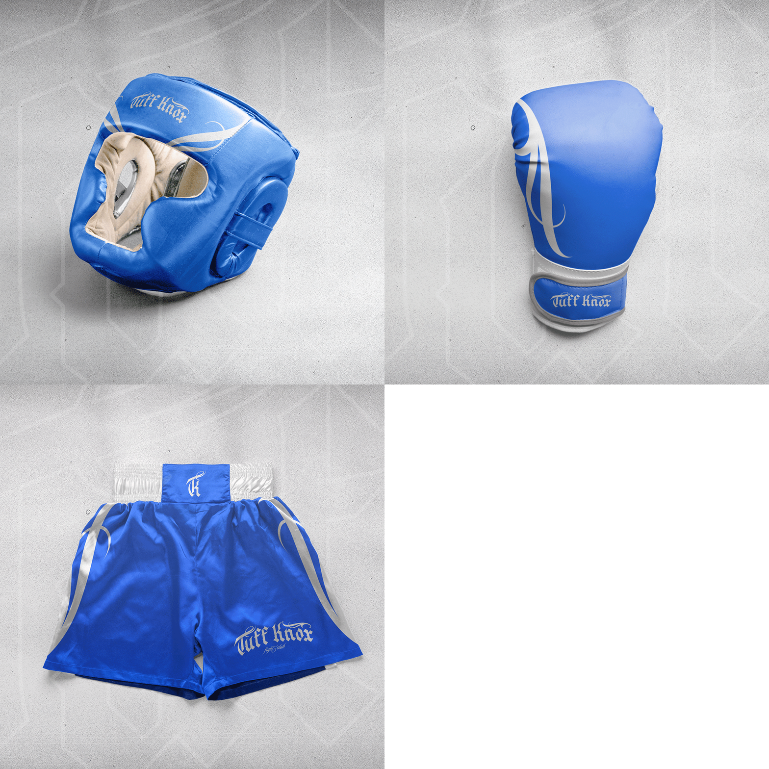
For this personal project, I developed a visual identity for Tuff Knox FC, a boxing club that embodies the gritty, street-inspired essence of the brand.
My goal was to attract a diverse, passionate boxing community. Drawing inspiration from San Diego’s vibrant streets and the tough world of combat sports, I created a brand that resonates with both professionals and amateurs alike.
I also aimed to showcase the power of hand lettering, proving its versatility as a core element of branding, adding a unique character that modernizes the brand’s image.
Stylescape made for this project. It's a curated visual direction that sets the tone for any project's brand identity.
THE PROCESS - VISUAL DIRECTION
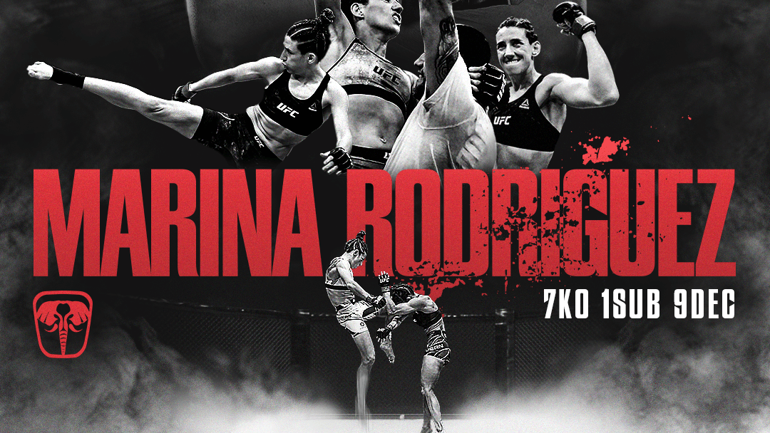
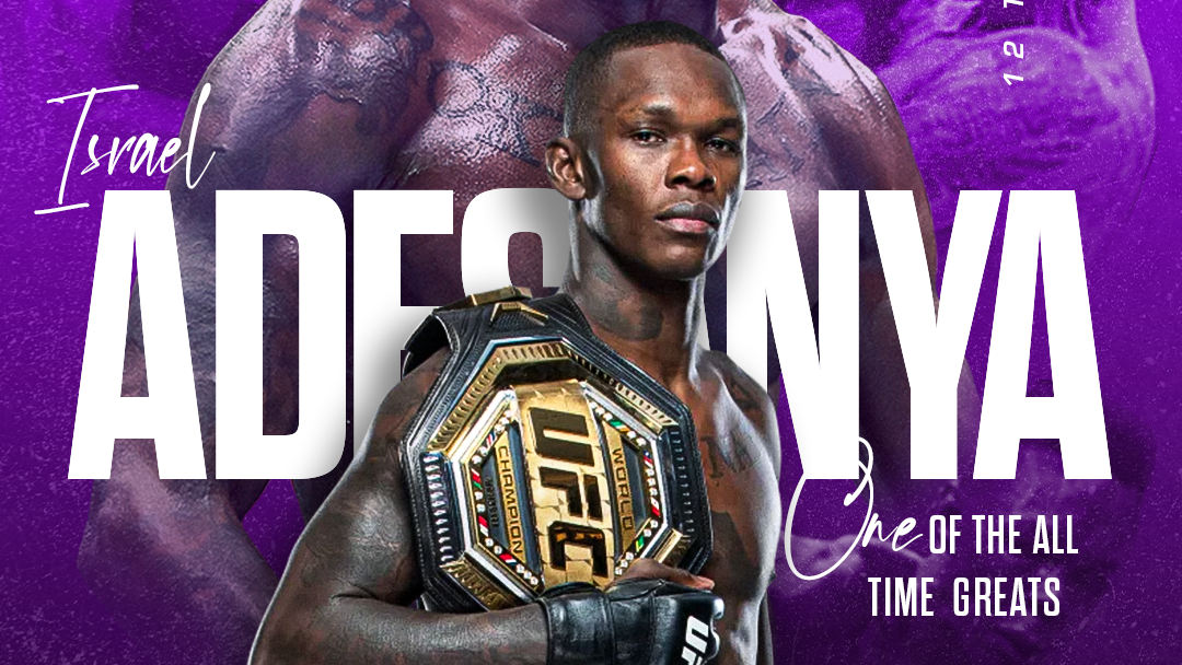
Creating the collage for this project was pure enjoyment, as it stemmed from my personal tastes. I knew I wanted to keep it raw and minimalist, which is why I limited the color palette. I drew inspiration from album covers, UFC posters, and even graphics outside of the striking sports world.
I also knew that Los Angeles and the entire West Coast are strongly associated with the color blue, which I chose as the main hue for Tuff Knox’s visual identity.
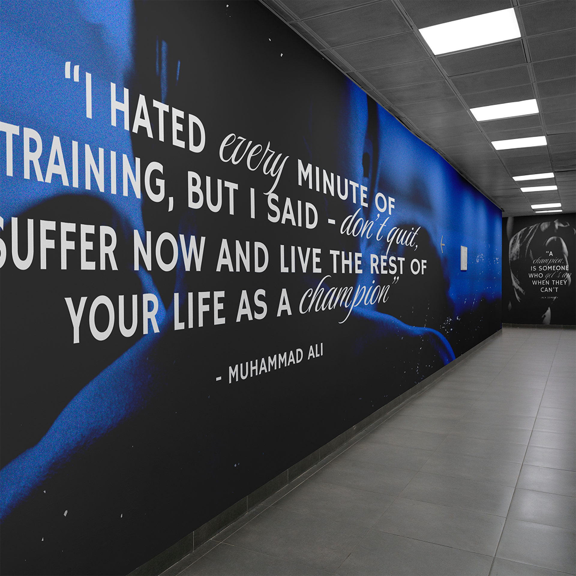
I really liked the idea of incorporating motivational quotes alongside sports photography—I think it’s a great concept. I’ve seen similar designs on the walls of other gyms, but I wanted to put my own spin on it for this project.
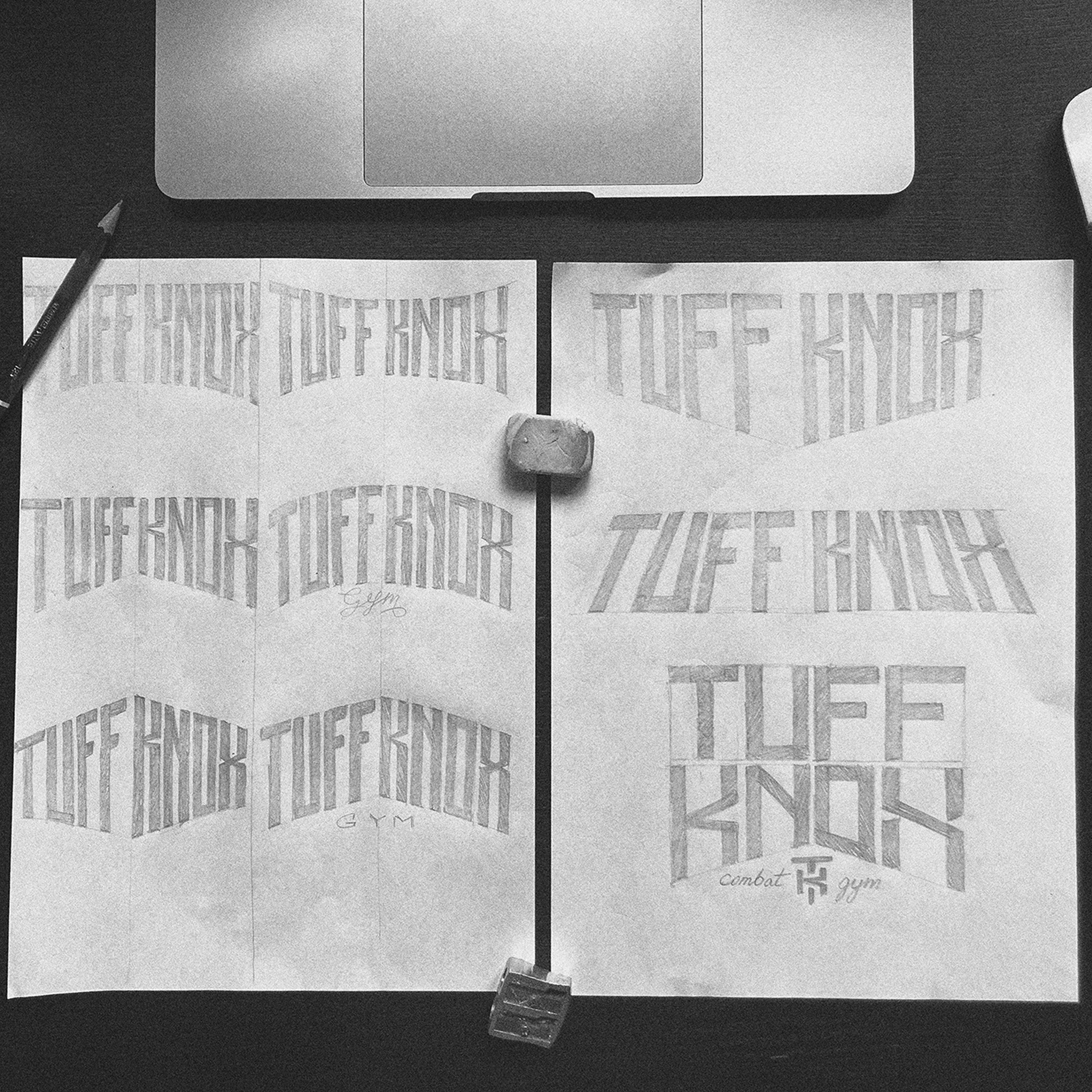
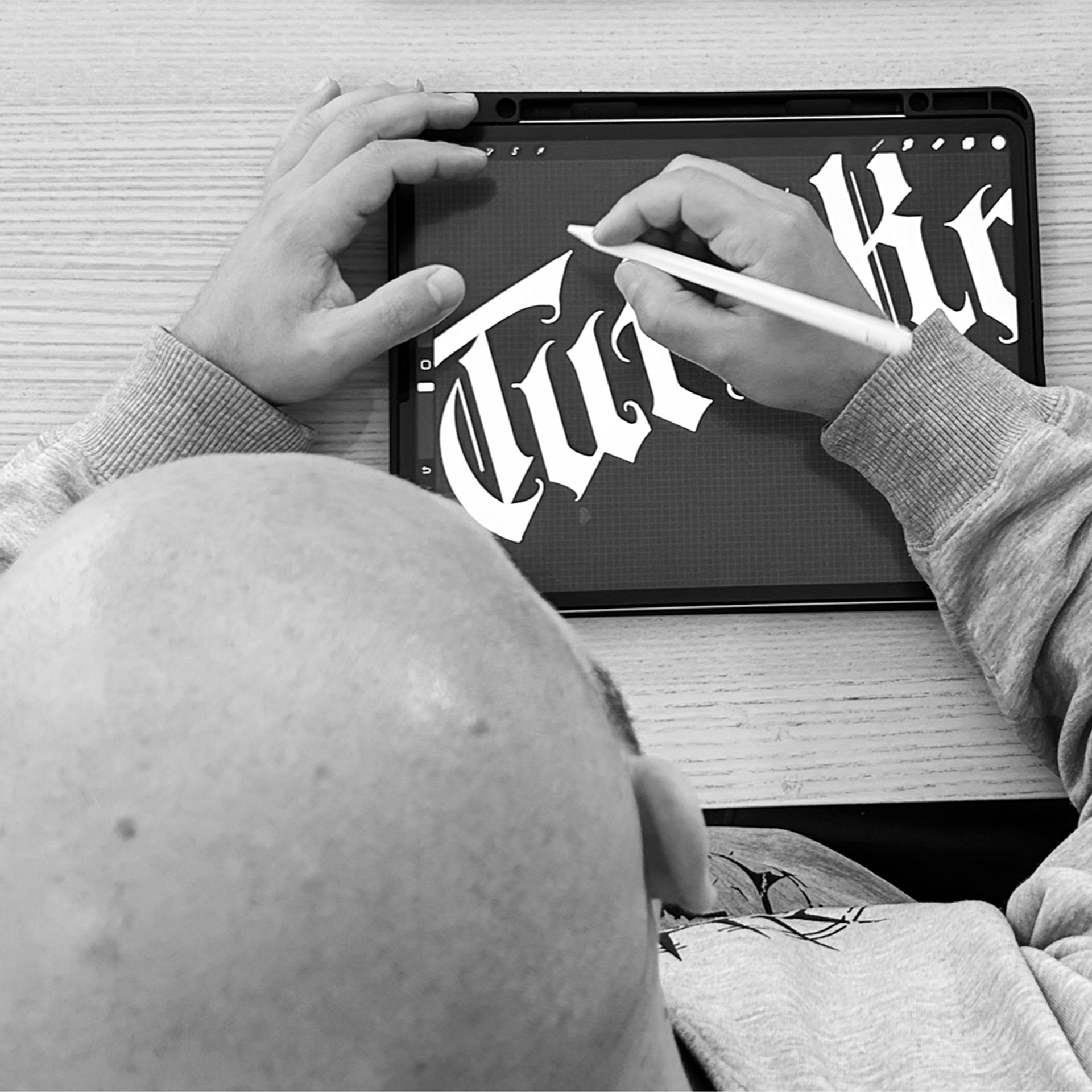
THE PROCESS - CRAFTING
The naming process kicked off with plenty of laughs, as part of a strategy workshop I often use to help clients clear their minds of the most outlandish ideas—Combat Wombat, Punch&GO, SuckerPunch Team, just to name a few. It’s a fun exercise, but it really helps get rid of the most ridiculous options and opens up space for real creativity.
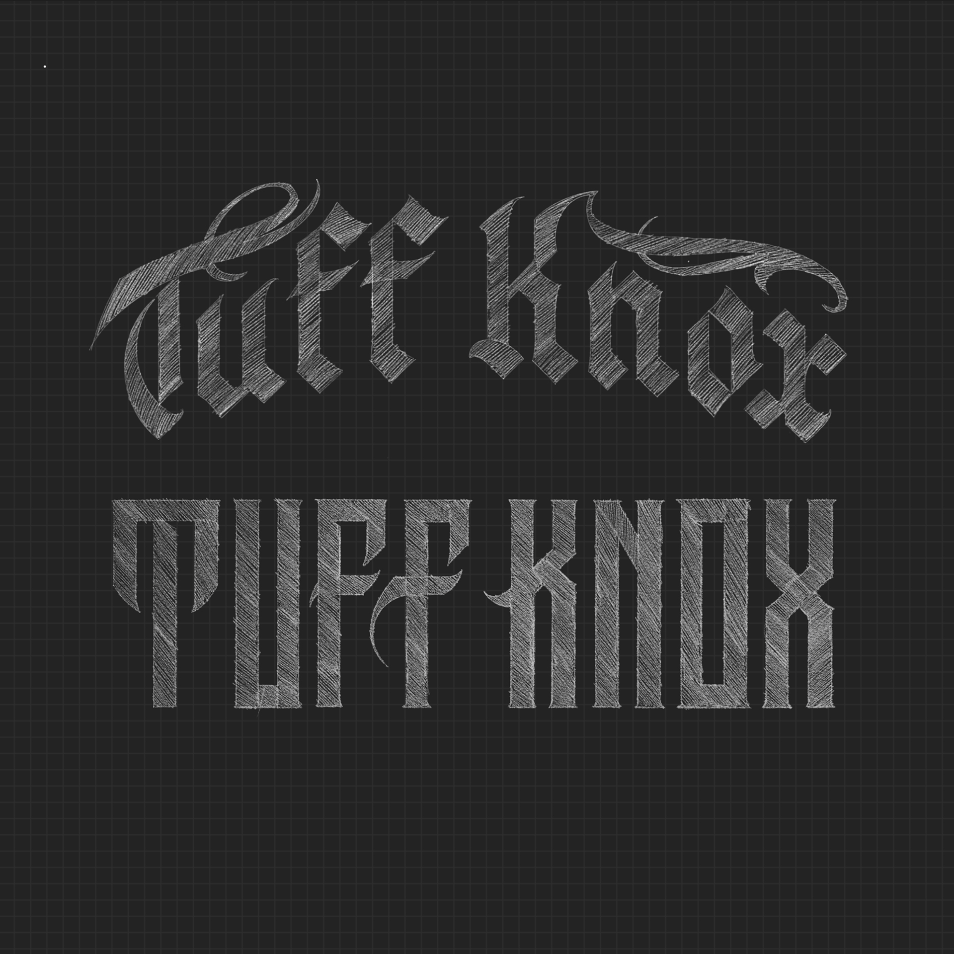
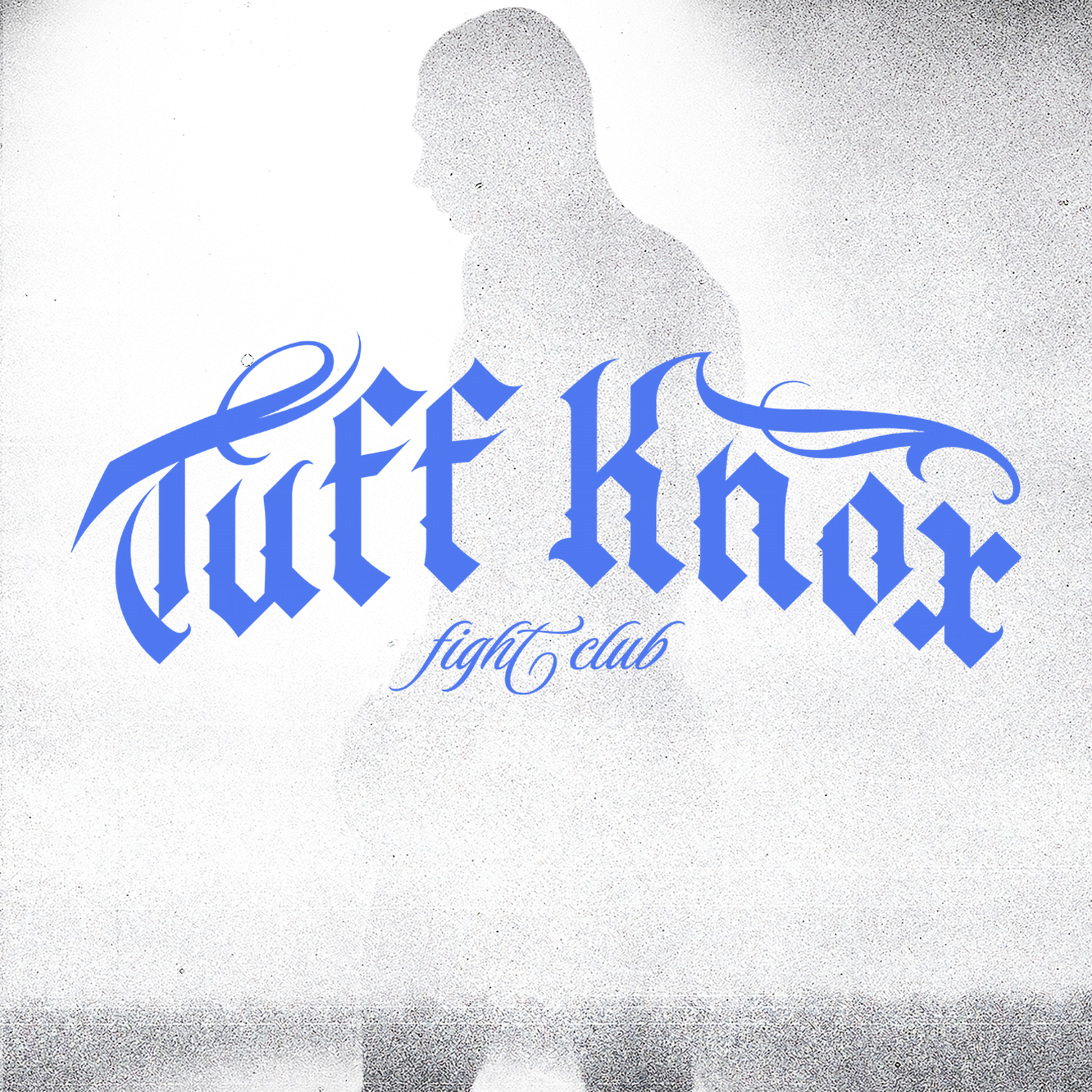
Staying true to the street style, I eventually transformed "Tough Knocks" into "Tuff Knox," adding a unique twist while firmly rooting it in urban culture.
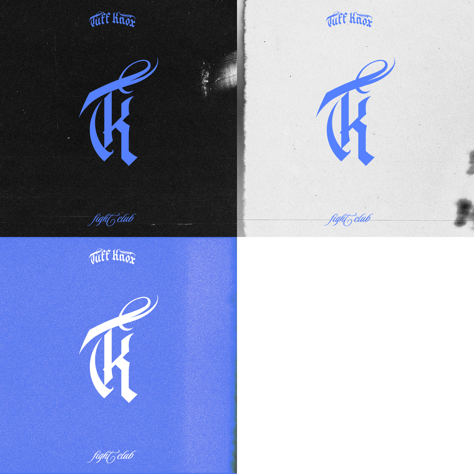
I developed the Blackletter font, which carries nearly 1,000 years of history and has gained widespread popularity among creatives across the globe. Chicano culture took it to another level, blending it with script fonts to craft a unique style that deeply resonates with me. That’s why I incorporated additional ornaments and flourishes on the letter ends to honor that influence.
The color palette—black, white, and primary blue—was carefully chosen for its strong ties to these urban regions.
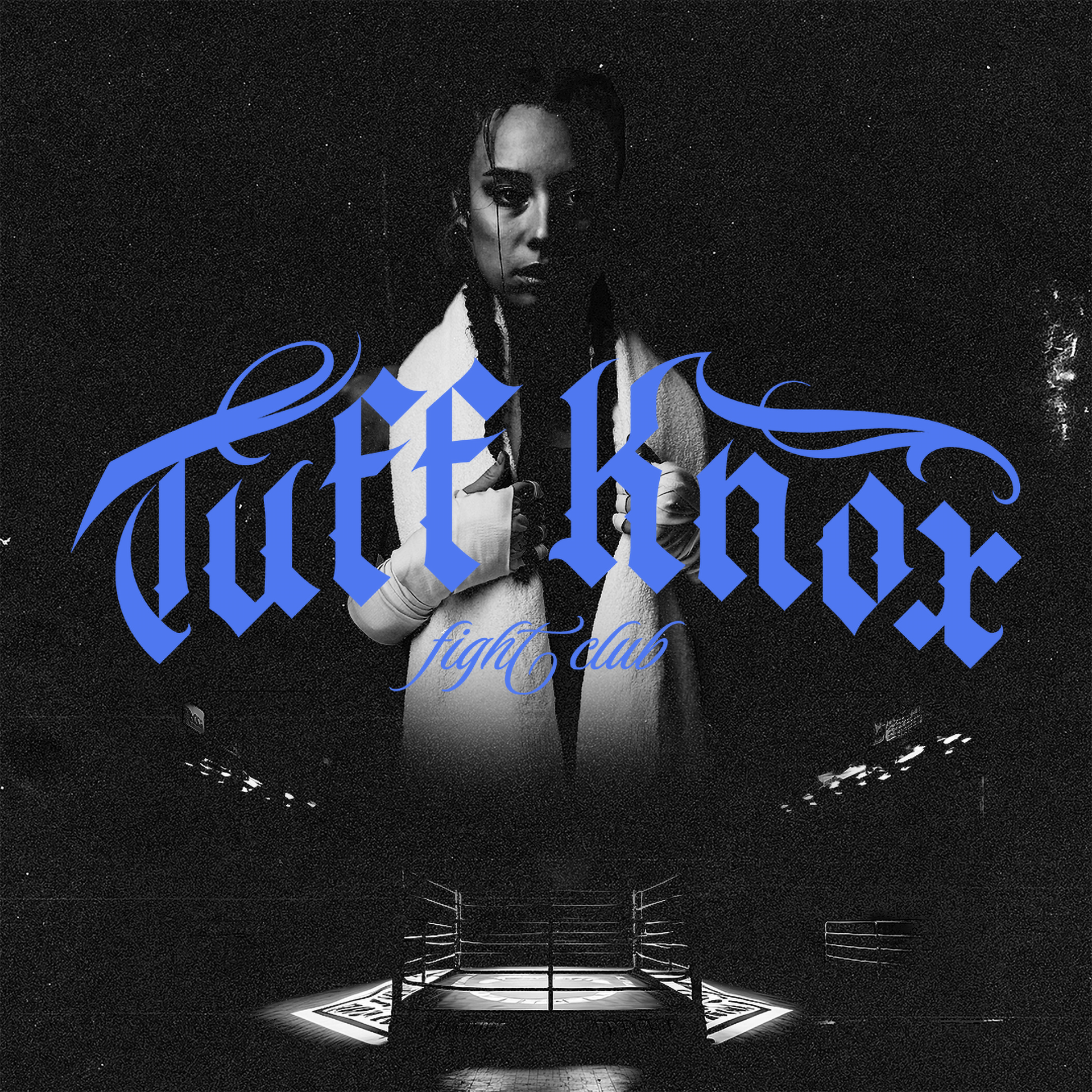
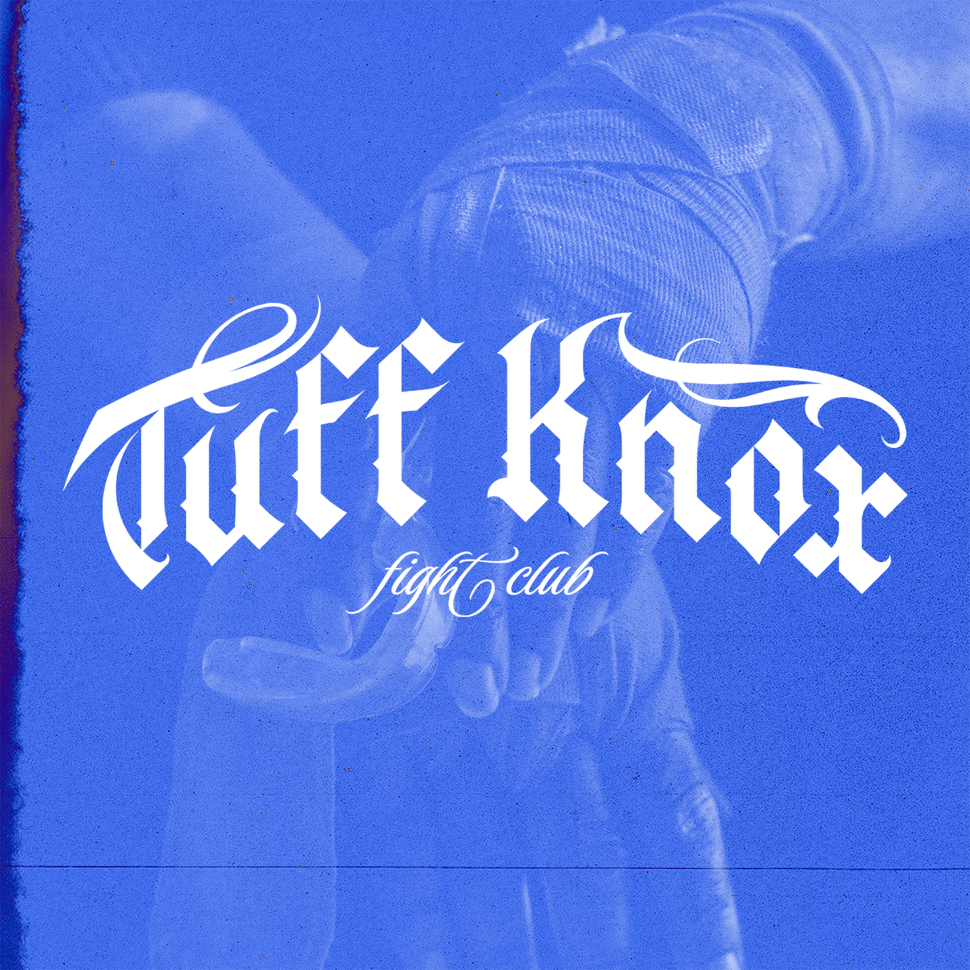
The choice of the athlete featured in the photo reflects my personal admiration for women in combat sports. As a fan of Joanna Jedrzejczyk and Claressa Shields, I wanted to challenge the stereotype that combat sports are exclusively for men.
I believe those outdated perceptions are a thing of the past, especially considering fights like Jedrzejczyk vs. Zhang, which was named MMA fight of the year in 2020 and garnered global attention. This event influenced my decision to put a woman on the cover of this project.
