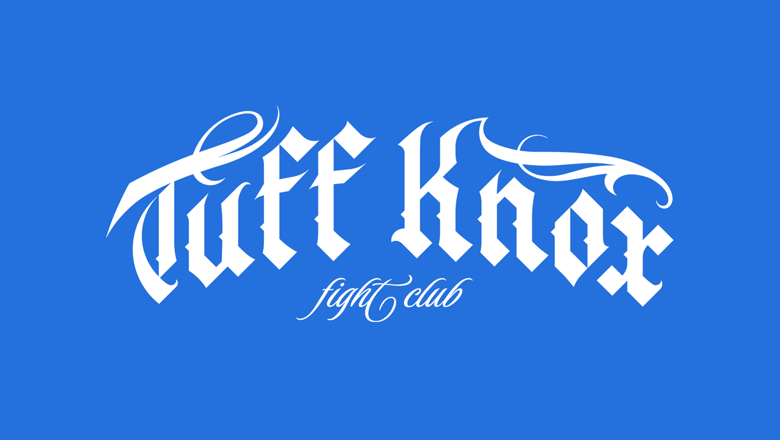
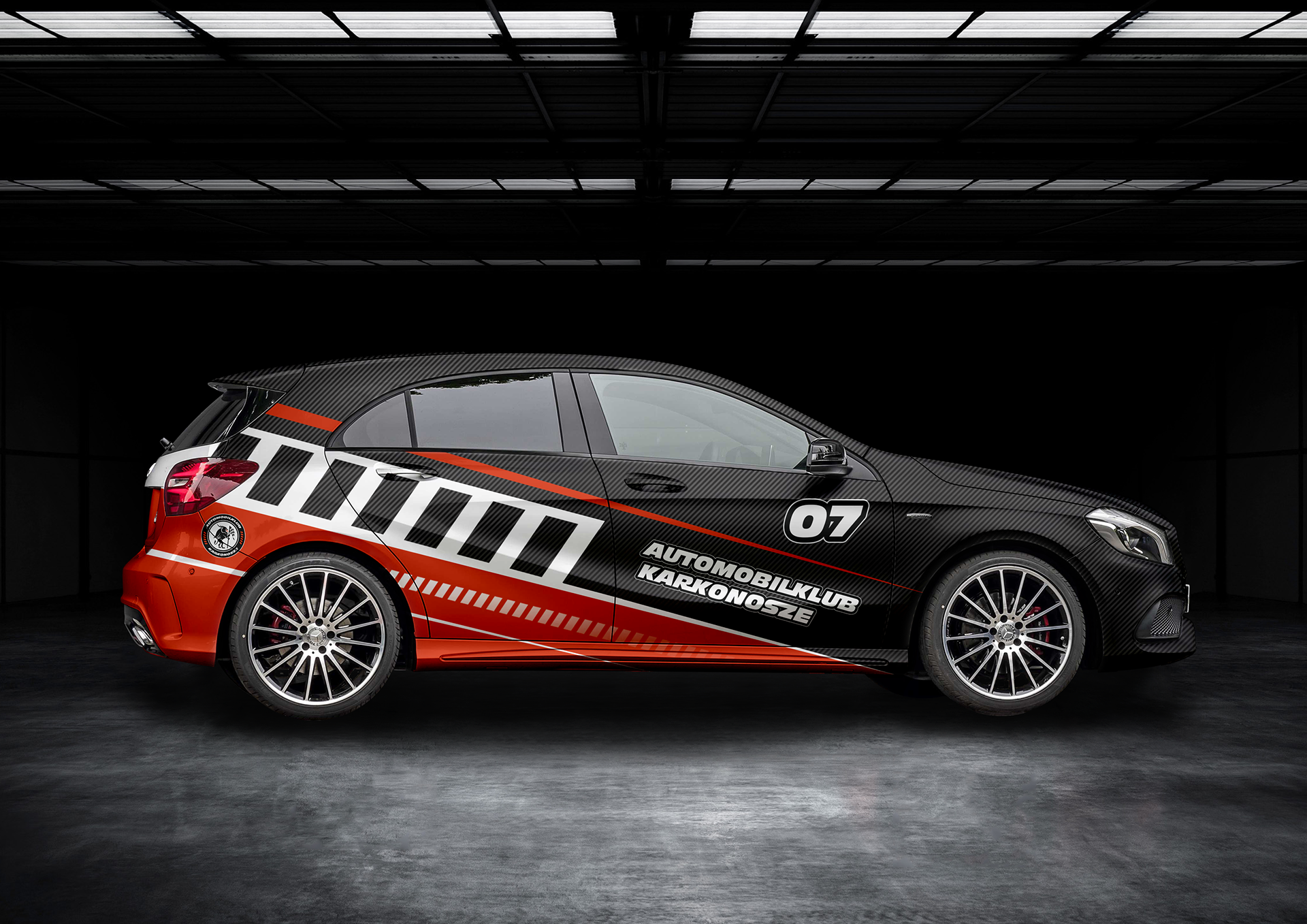
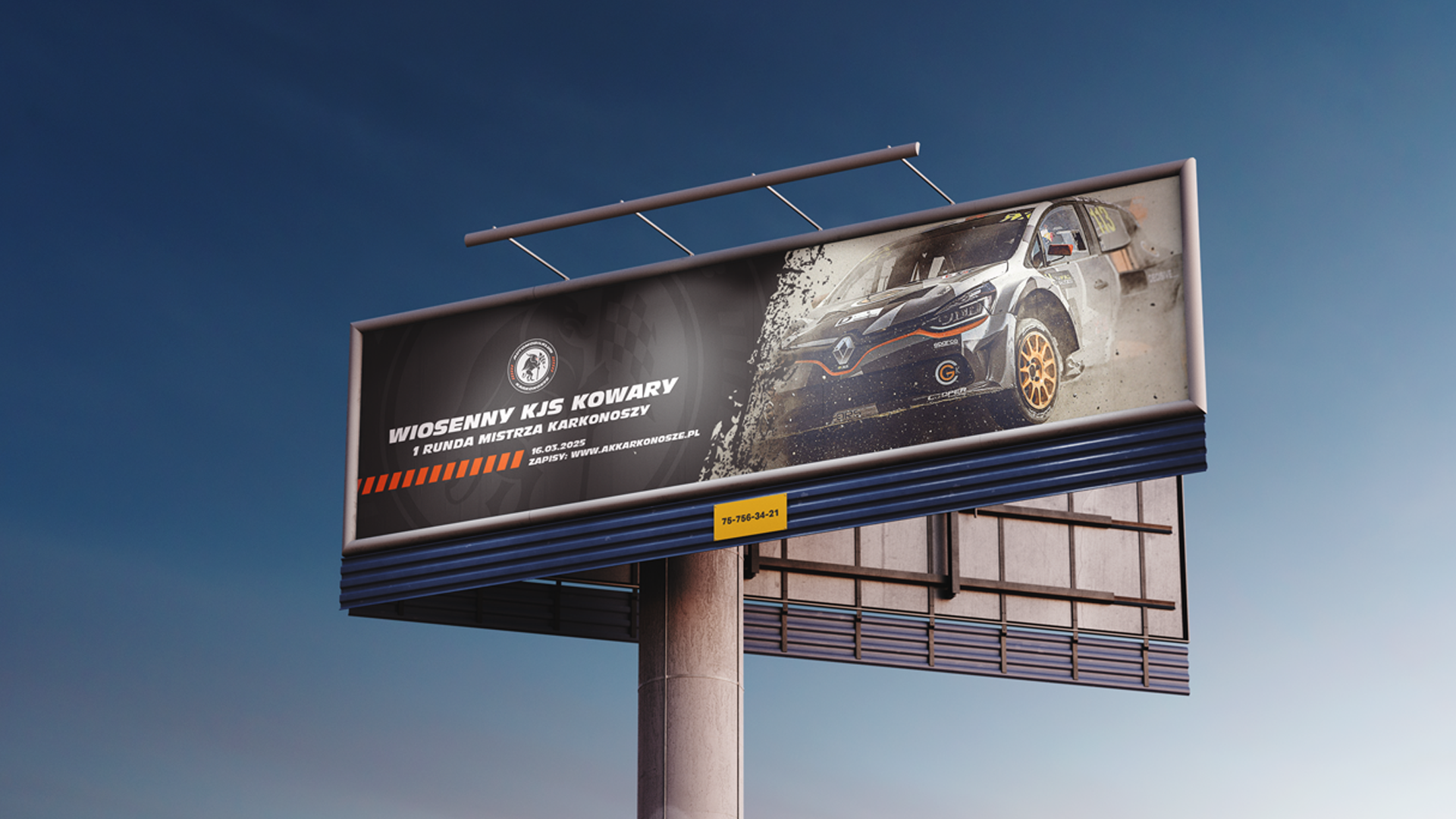
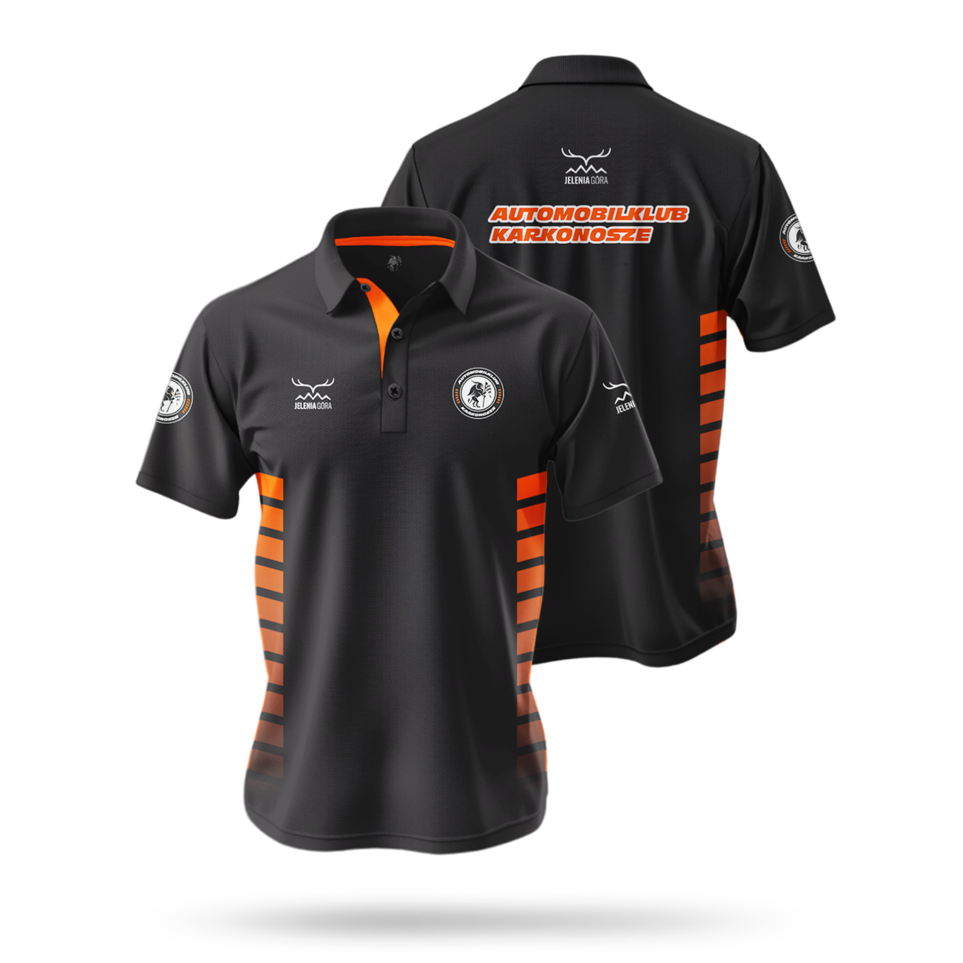
SERVICES - LOGO / CAR WRAP / MERCH / SIGNAGE
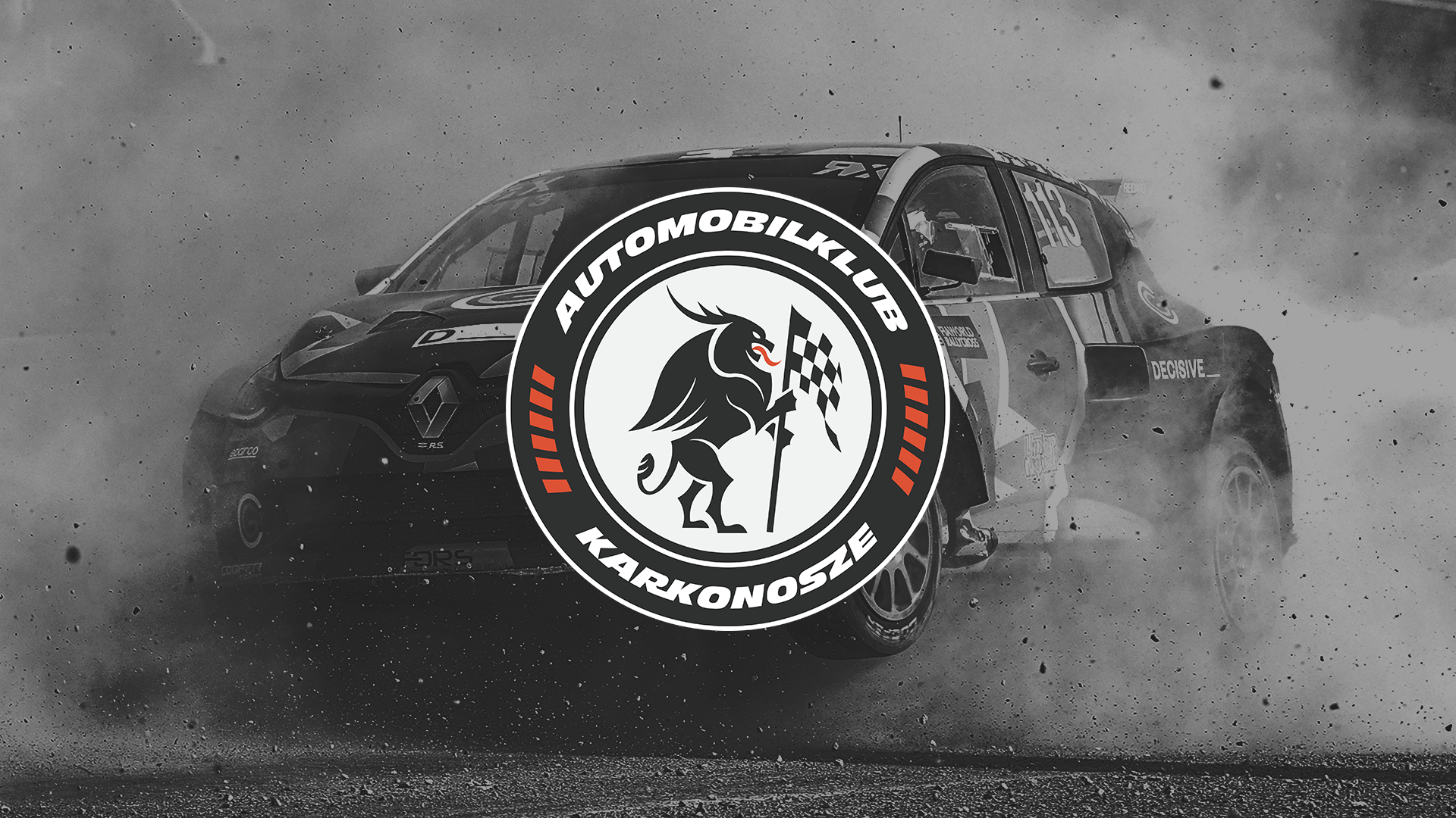
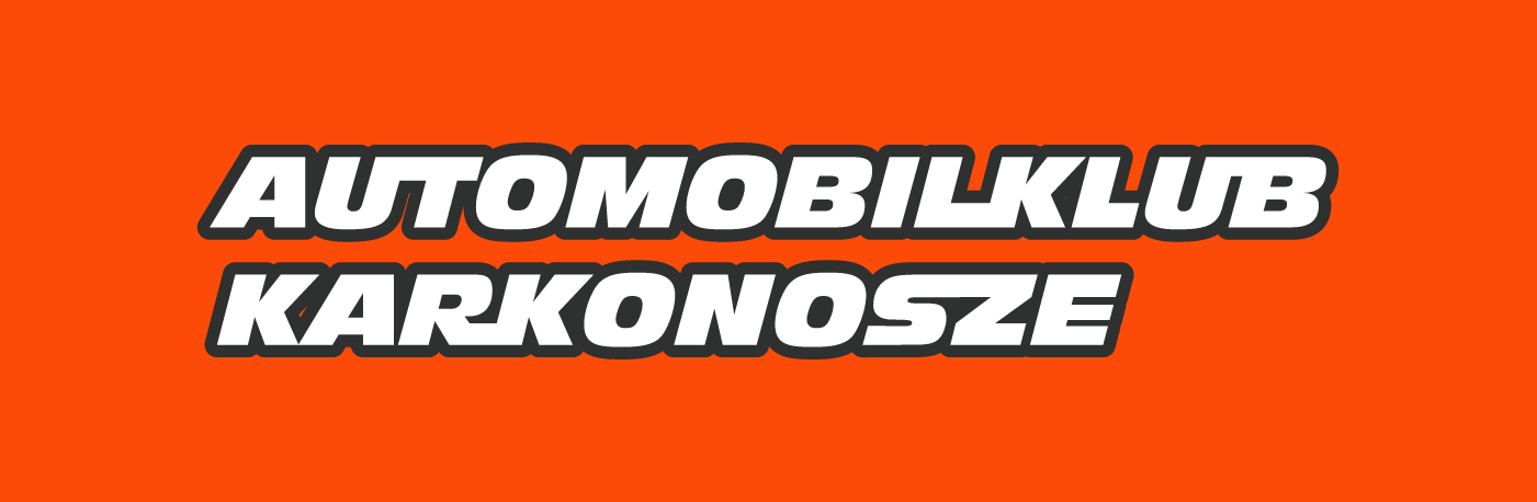
Motorsports have a strong presence in my city, deeply rooted in the surrounding terrain—nestled in a valley, bordered by the Karkonosze mountains, open clearings, and dense forests rarely explored by the public. Within this landscape, the Karkonosze Automobile Club was established, a community-driven organization run by passionate motorsports enthusiasts.
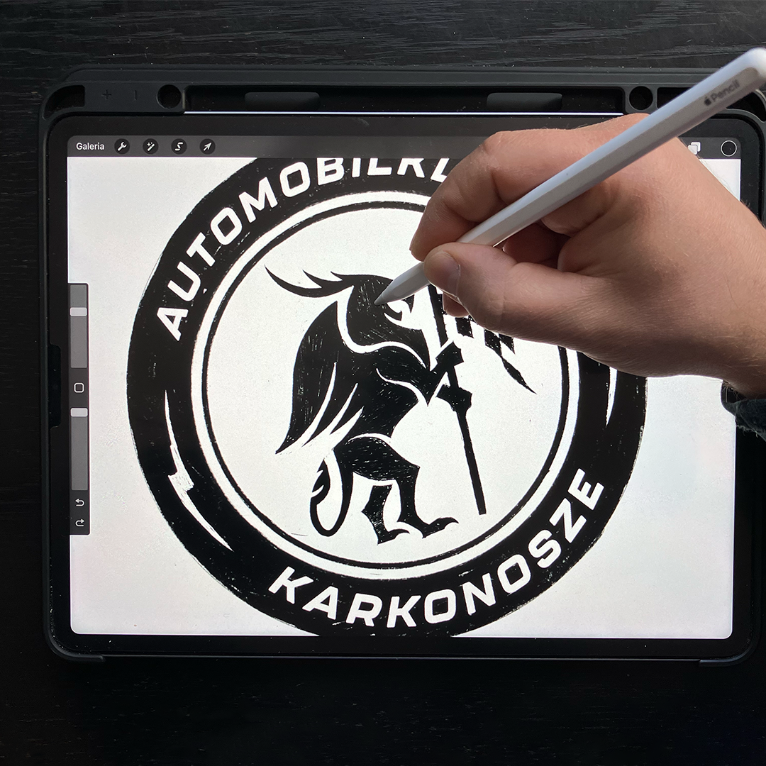
While attending one of their events, I found myself analyzing their promotional materials—what I can probably call a professional deviation. Their logo immediately caught my attention; it had a compelling concept but lacked the visual impact it deserved. As a designer, a local patriot, and an adrenaline-driven sports fan, I saw an opportunity. I wanted to refine and elevate the club’s visual identity, so I took the risk of approaching the club owner with a new idea. I had no expectations—either he’d like it, which would be great, or he wouldn’t, in which case I’d still have a solid project for my portfolio. A win-win in my book.
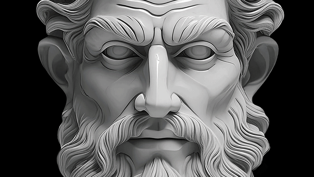
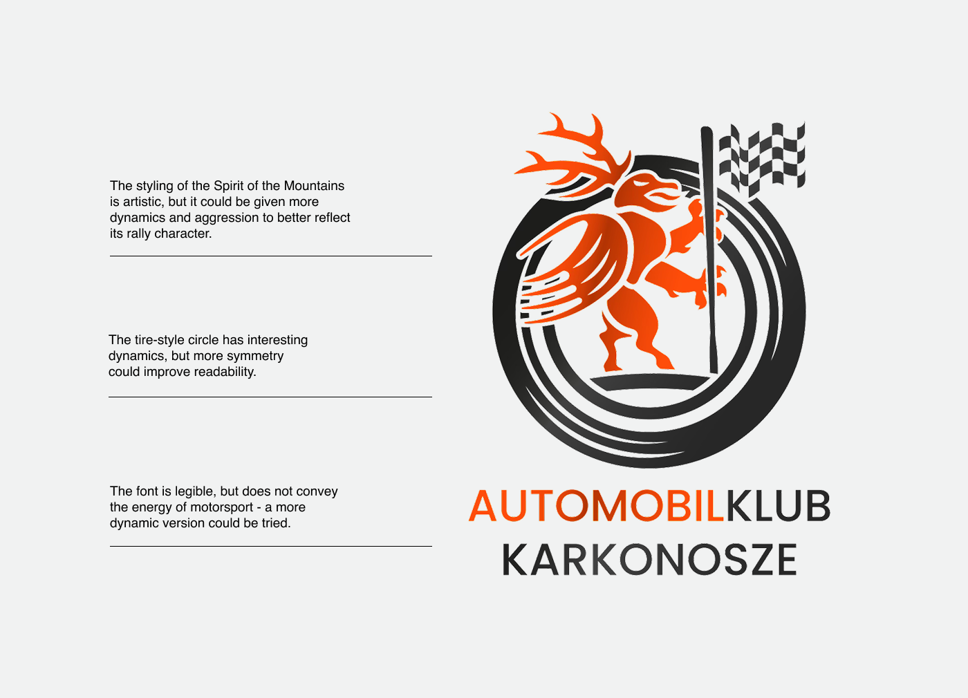
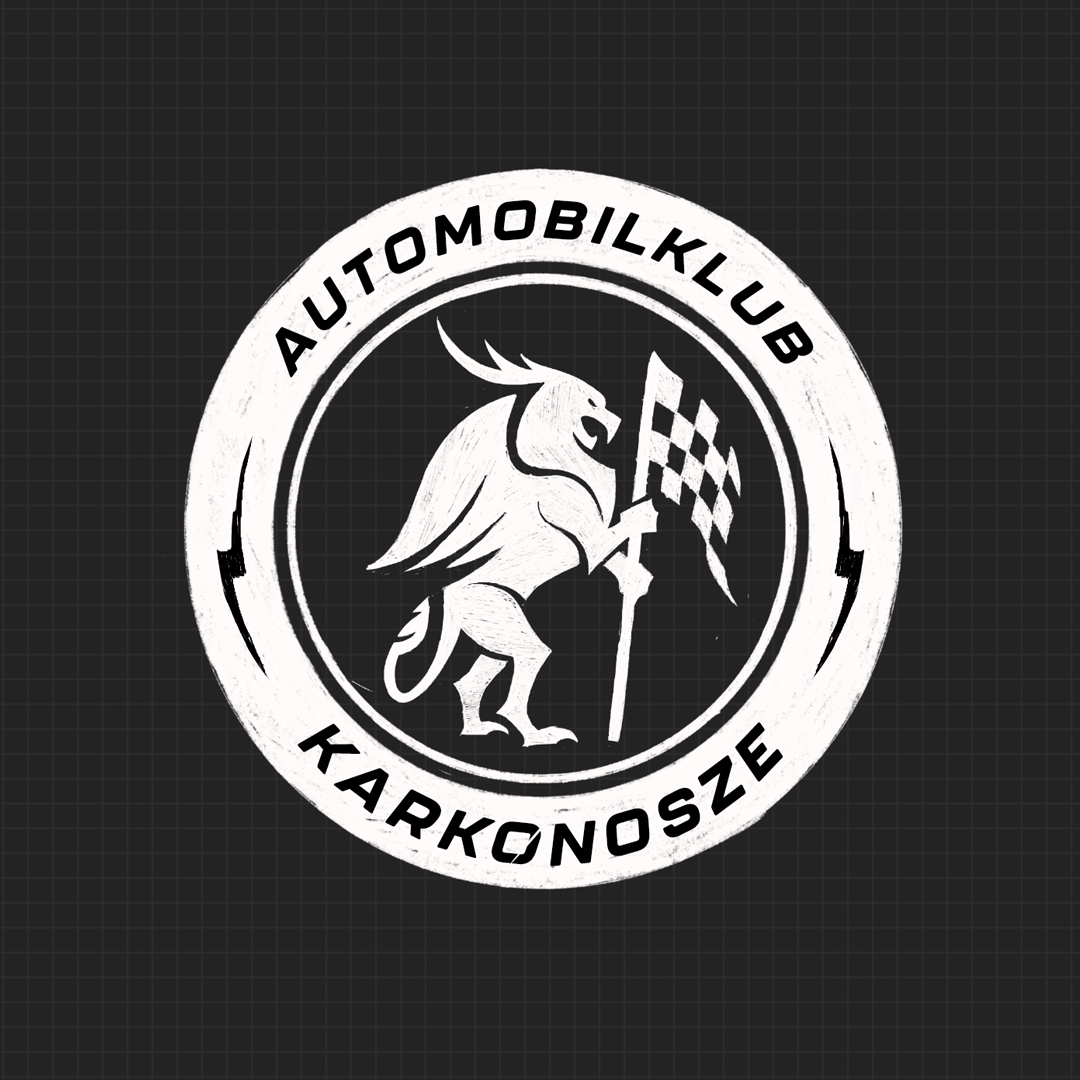
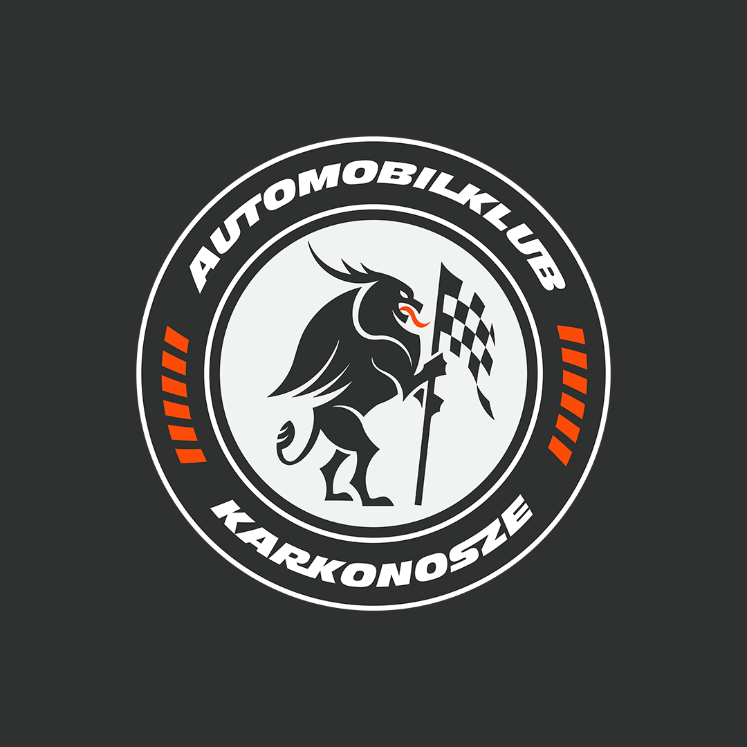
The primary objective of this project was to redesign the Karkonosze Automobile Club’s logo, refining its visual identity while preserving its core spirit. During the redesign process, I set a benchmark of staying true to the original, which consisted of the figure of the Mountain Spirit holding a rally flag (a mythical creature from the nearby mountains), inscribed in a circle that had the character of a rally tire.
I saw several opportunities for improvements here:
I saw several opportunities for improvements here:
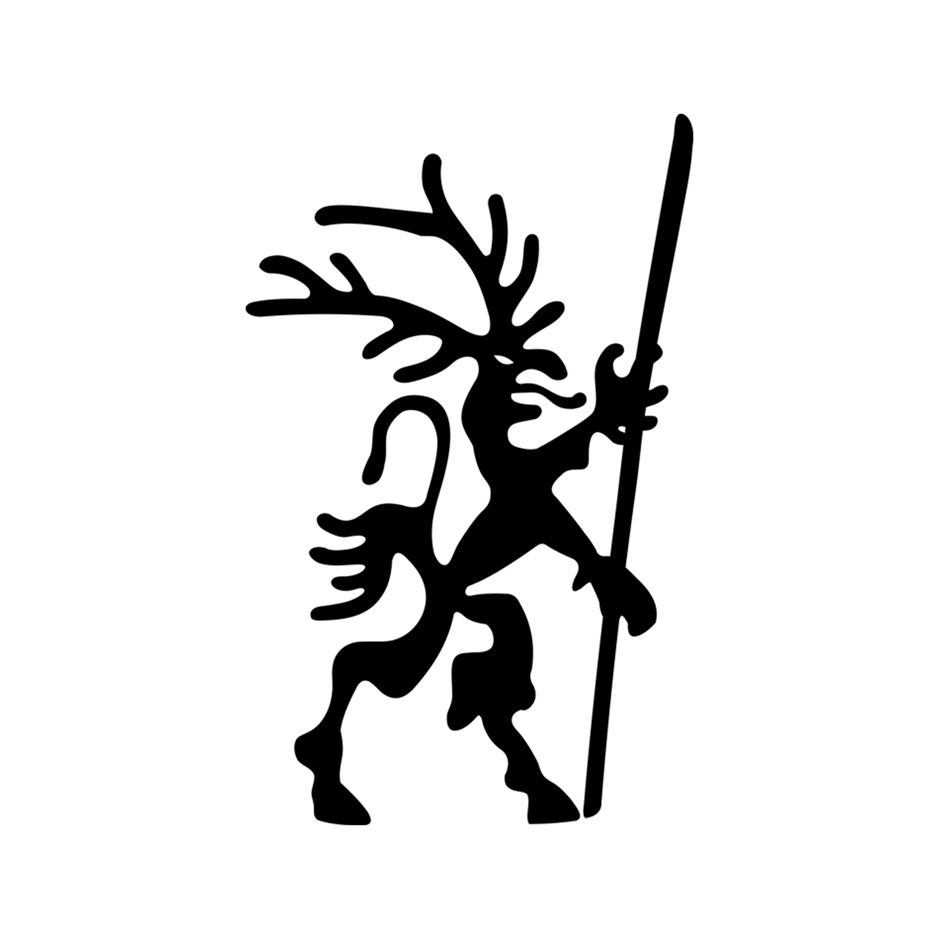
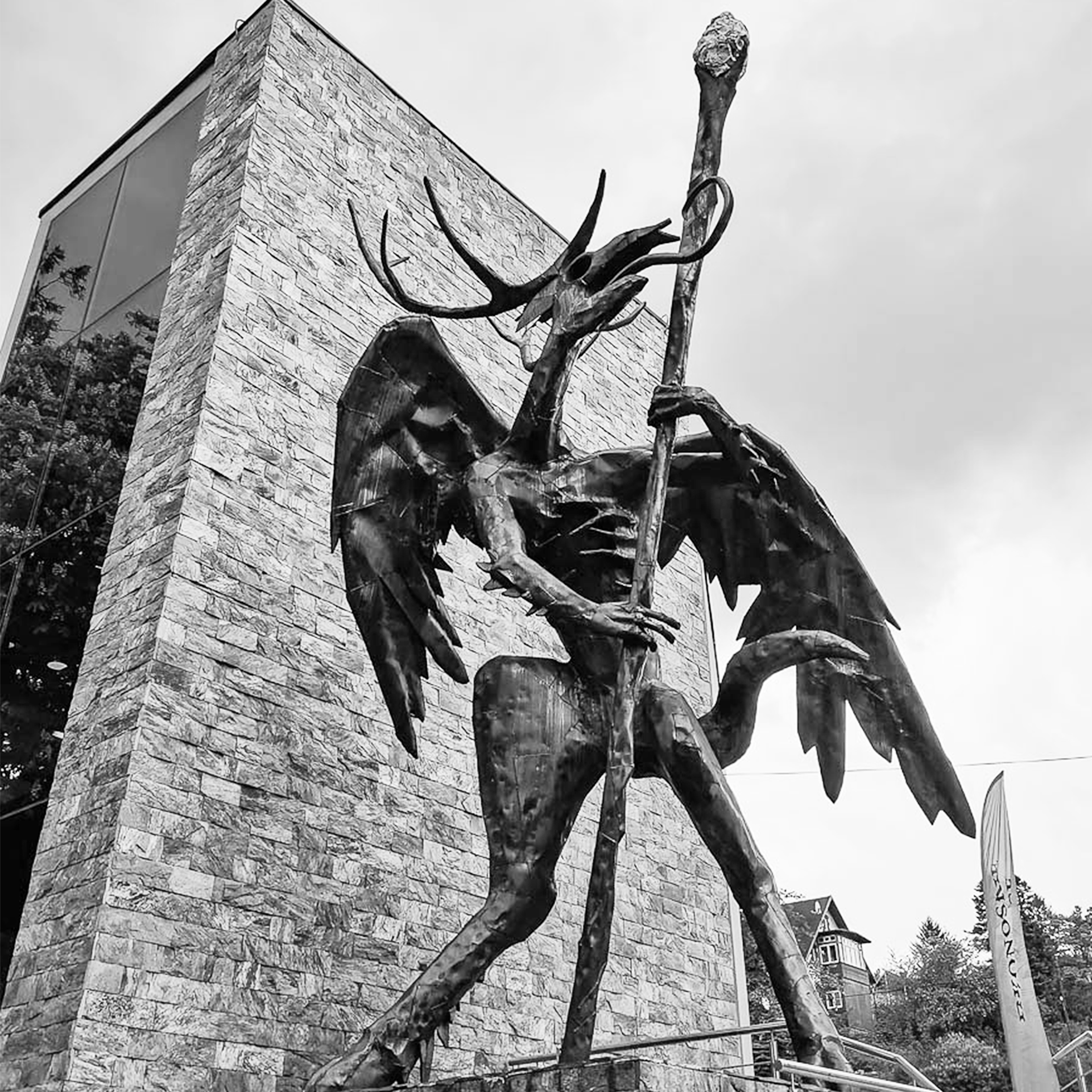
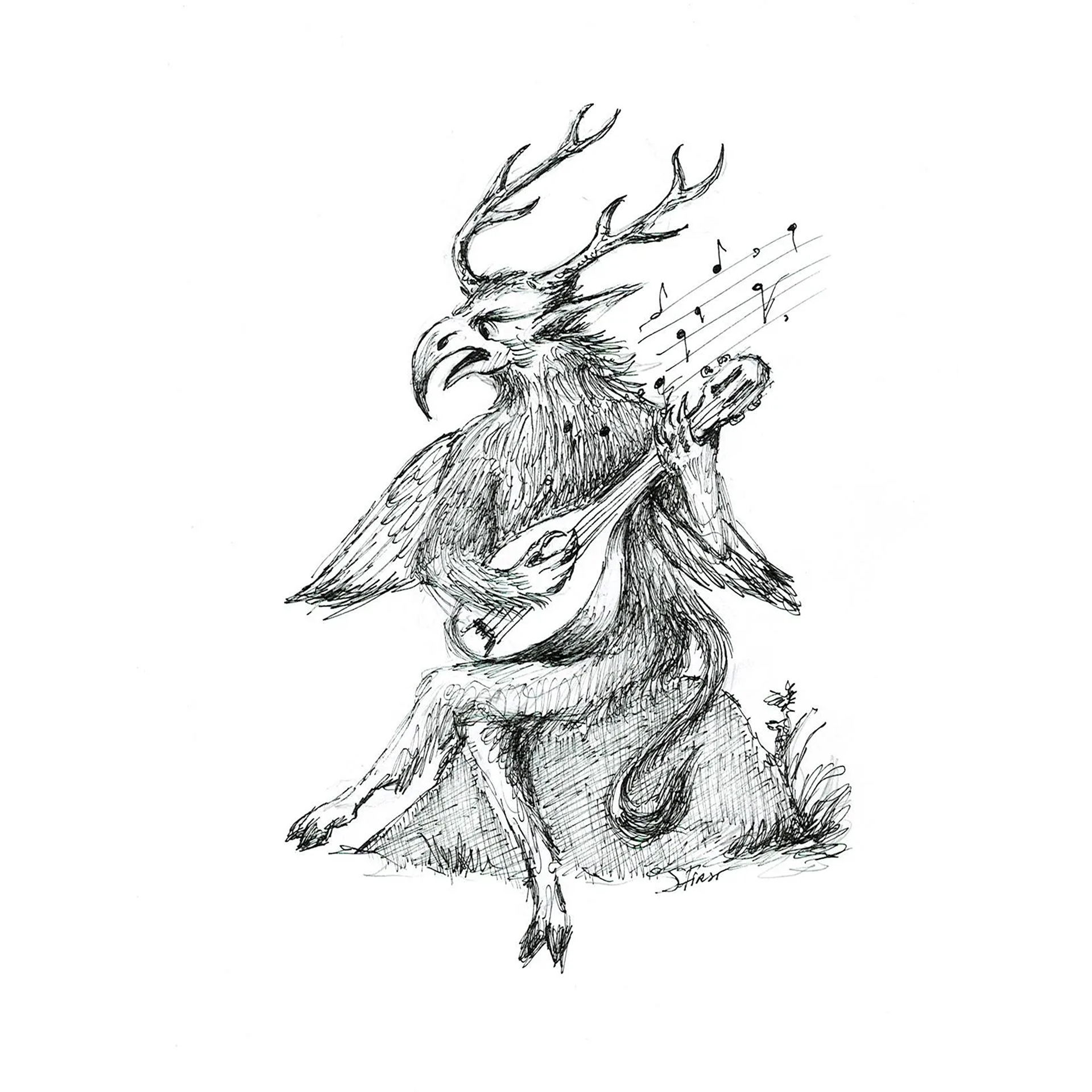
From the left: 1) the oldest known version of the Spirit of the Mountains from the 16th century, author - Martin Helwig, 2) Sculpture located in Karpacz, authors: Igor Morski & Grzegorz Pawłowski 3) Musical Spirit of the Mountains, author - S. Firszt
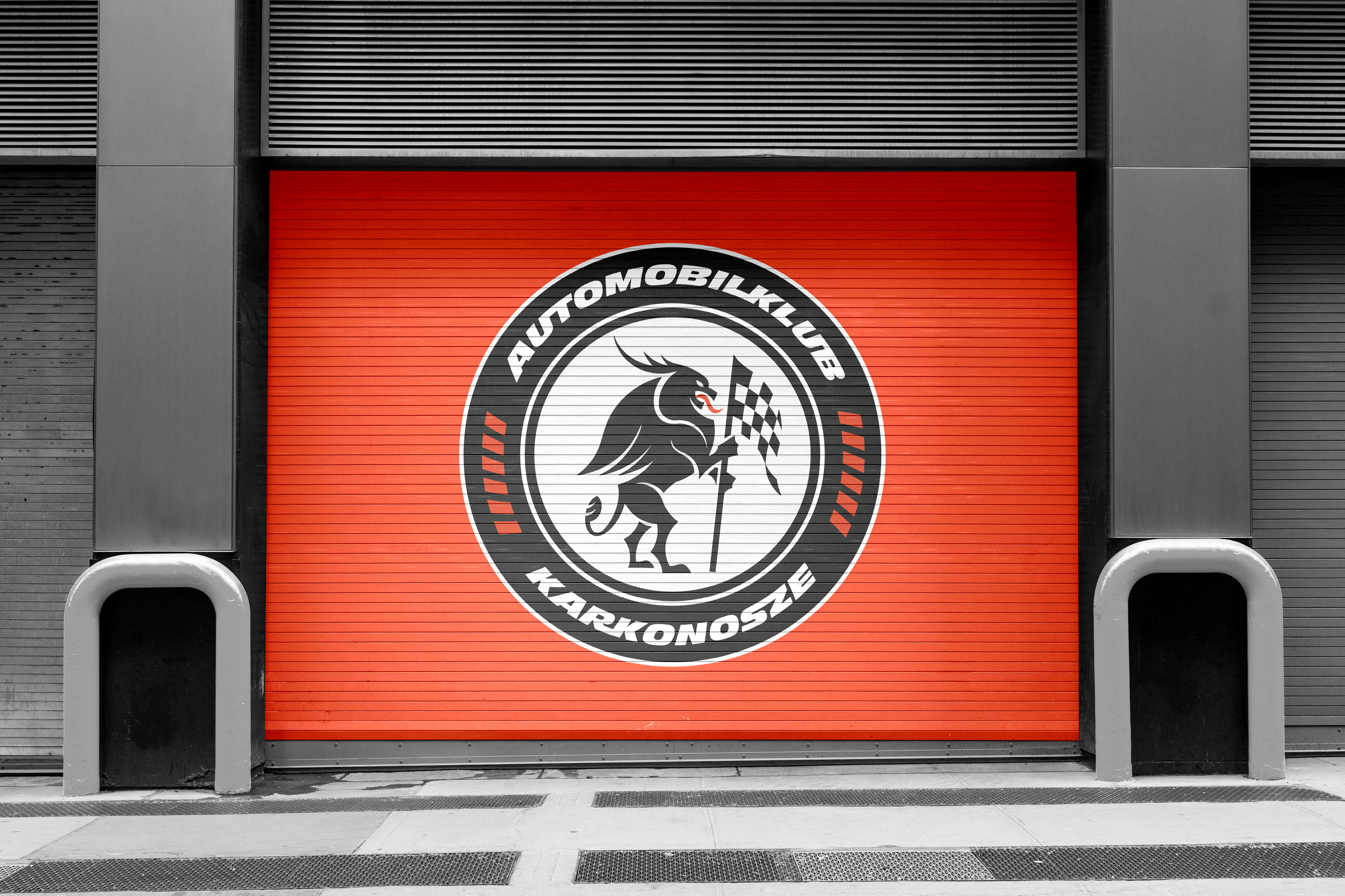

In the end, presenting the idea gave me the opportunity to finally meet the club owner and have a chat. While he appreciated the design, he decided to stick with the current logo for now, explaining that it had only recently been implemented. However, he saw potential for collaboration in the future.
I had been missing a project like this in my portfolio—especially with so many lettered logos lately. This emblem adds some much-needed variety and freshness, and for now, it will wait for its moment. But I believe in it because, honestly? I think it turned out pretty damn good.
I had been missing a project like this in my portfolio—especially with so many lettered logos lately. This emblem adds some much-needed variety and freshness, and for now, it will wait for its moment. But I believe in it because, honestly? I think it turned out pretty damn good.