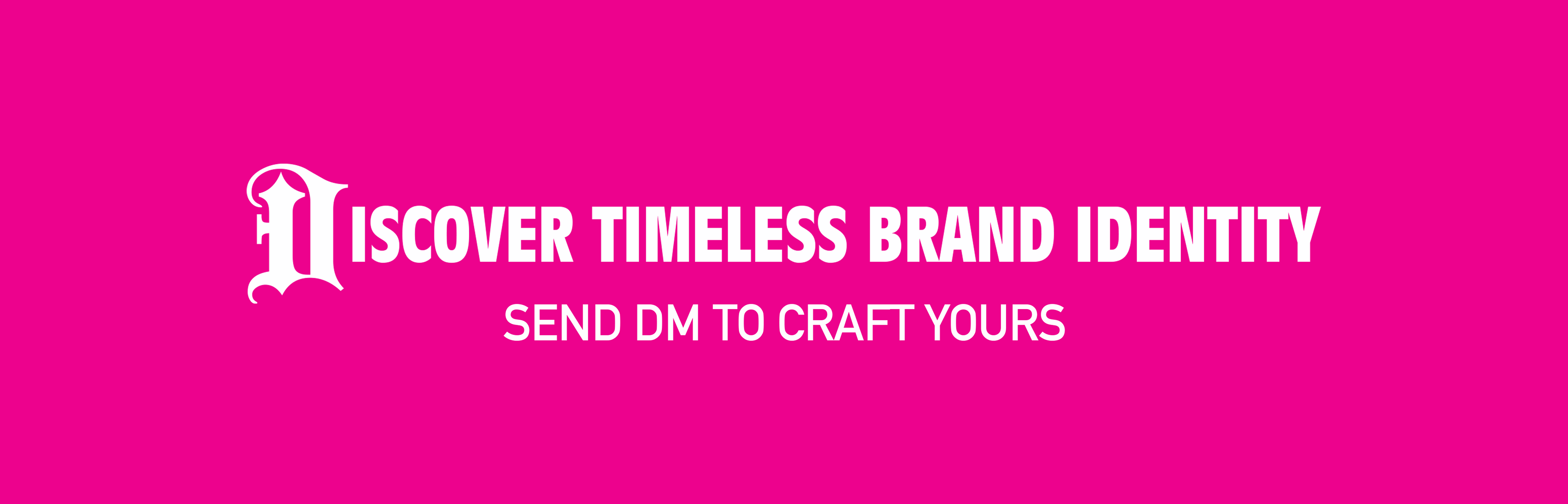
SERVICES - LOGO REDESIGN / SIGNAGE / BRAND SLOGAN
IMPACT - BRAND RECOGNITION / DIFFERENTIATION FROM THE COMPETITION
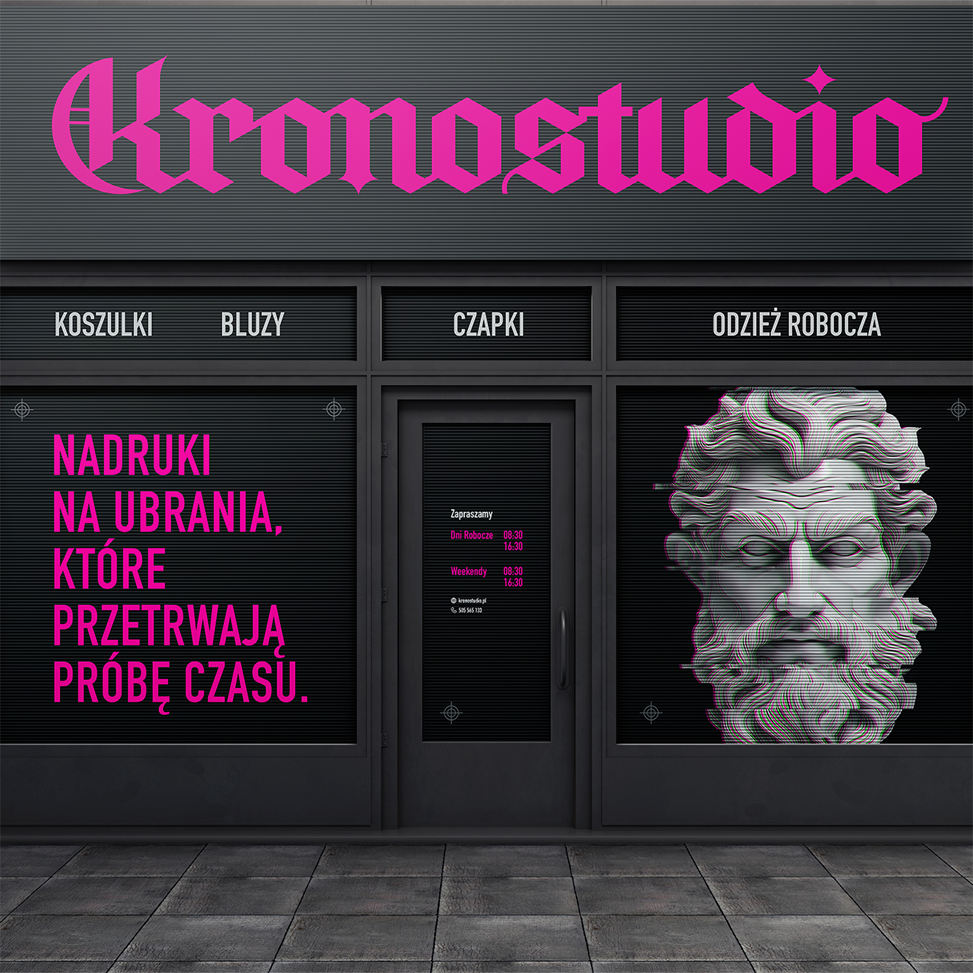
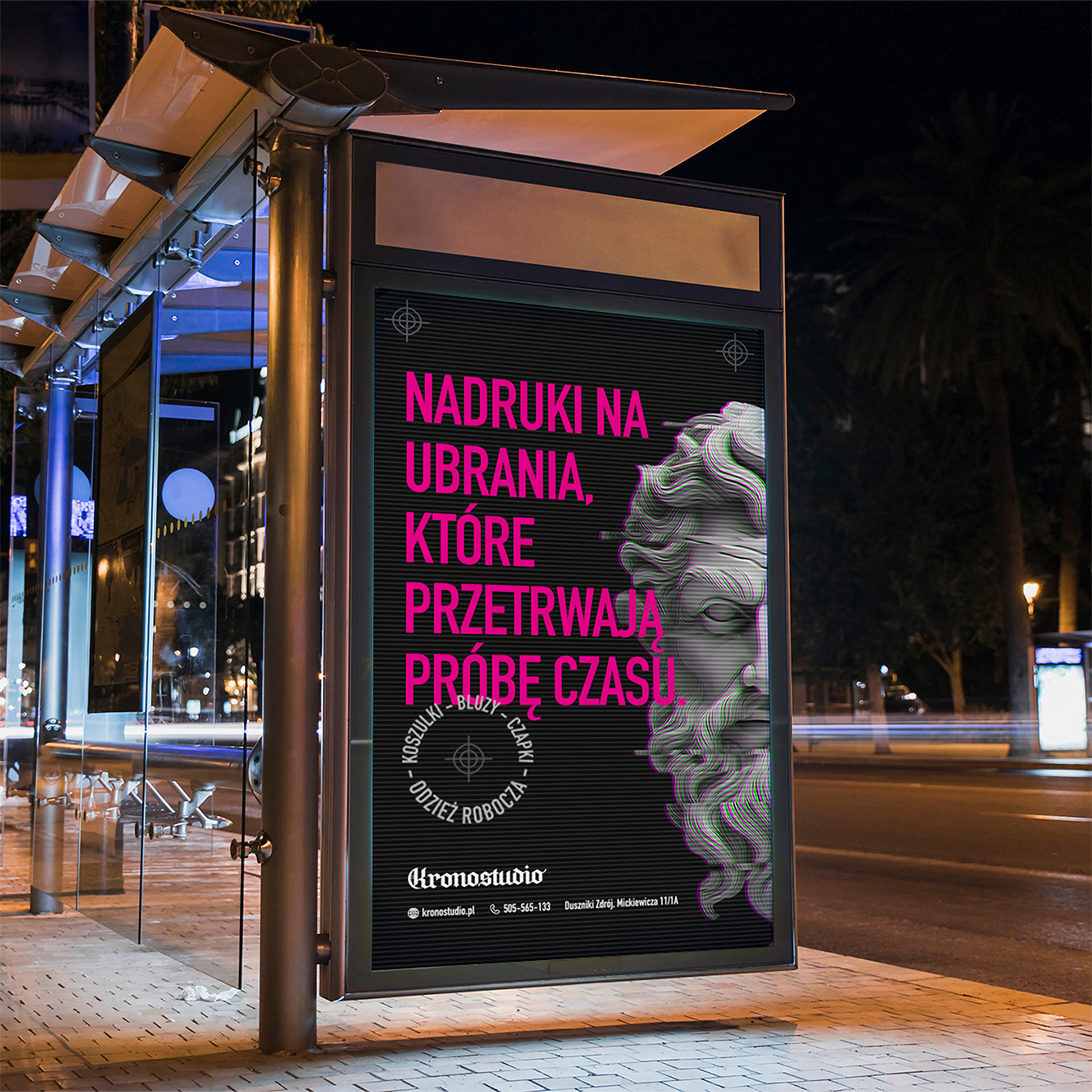
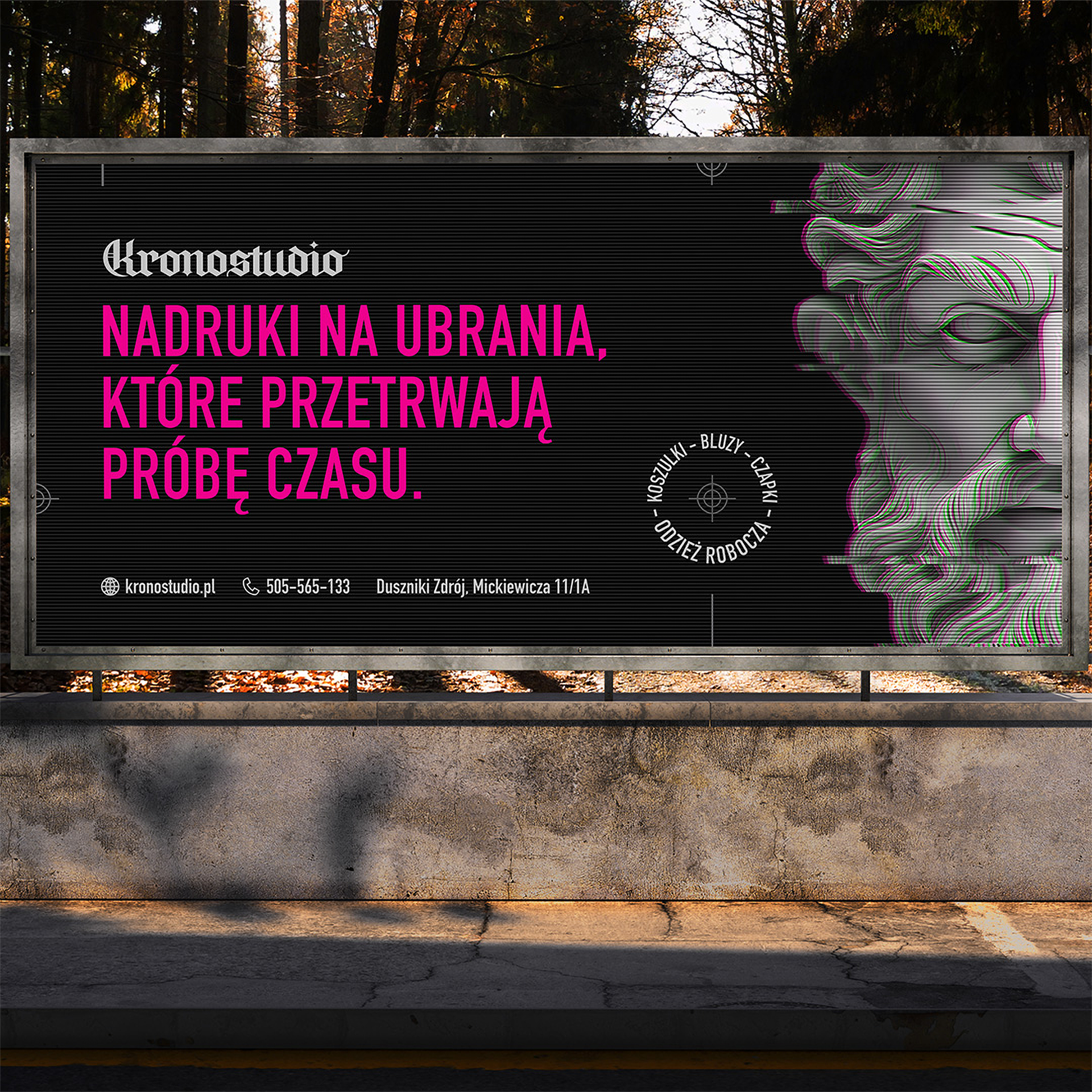
When I received an email from the owner asking for help in creating a new image for his print shop, I immediately knew we could craft something more unique than what most competitors had in their visual identity.
My client, a fan of history and books, loved the idea of using Kronos in the first campaign. Inspired by a previous project I did for a boxing club, he wanted his new logo to follow the same style.
The campaign's slogan, referencing the mythological titan, tied the project together: 'Prints That Stand the Test of Time'. Armed with this fresh identity, my client was now ready to outshine the competition with something truly memorable.
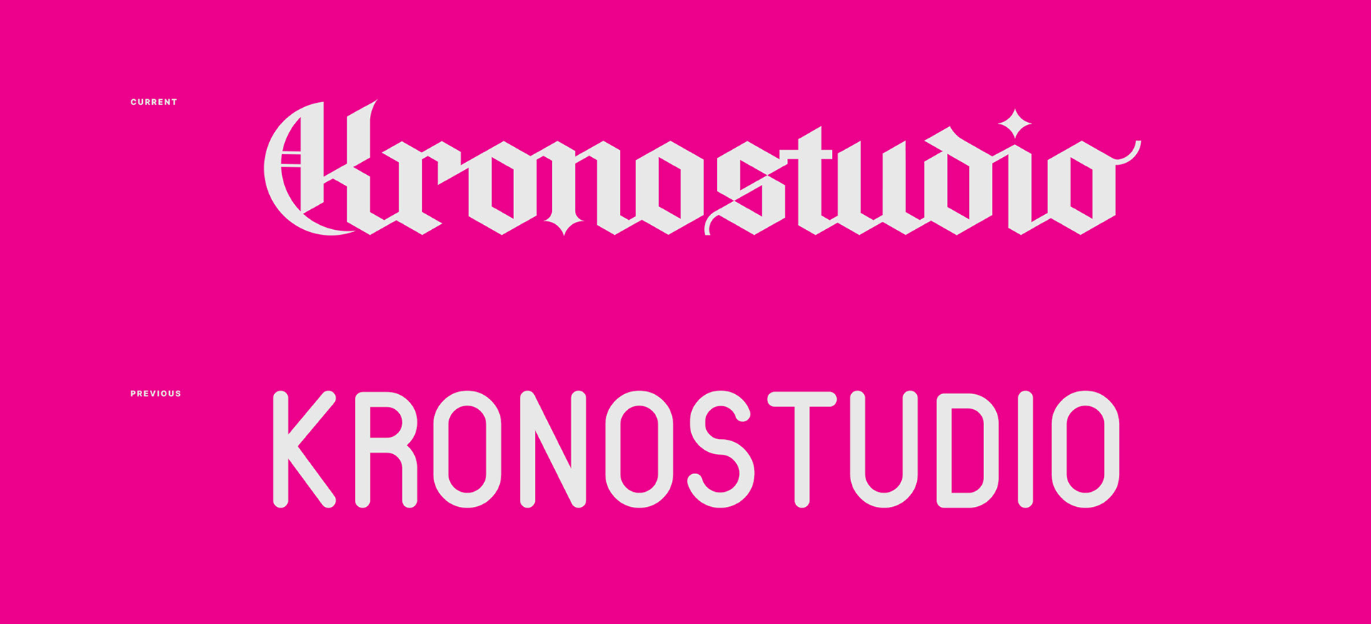
When selecting the color palette, I chose magenta for its striking appearance against a monochromatic background. As one of the four primary colors in printing, it serves as a base for creating other hues.
This choice not only enhances the visual appeal but also aligns seamlessly with Kronostudio's industry focus, highlighting its professional identity.
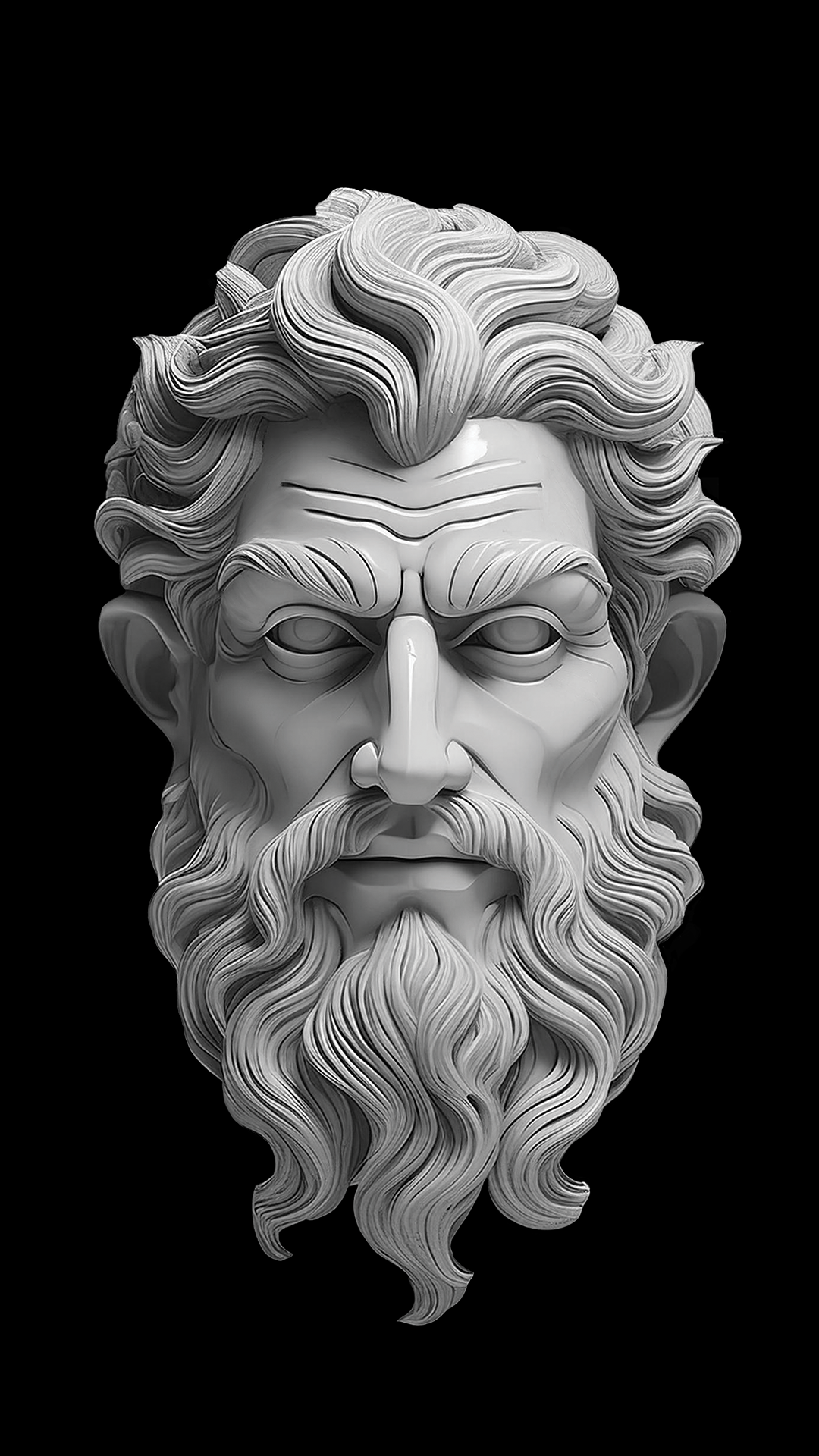
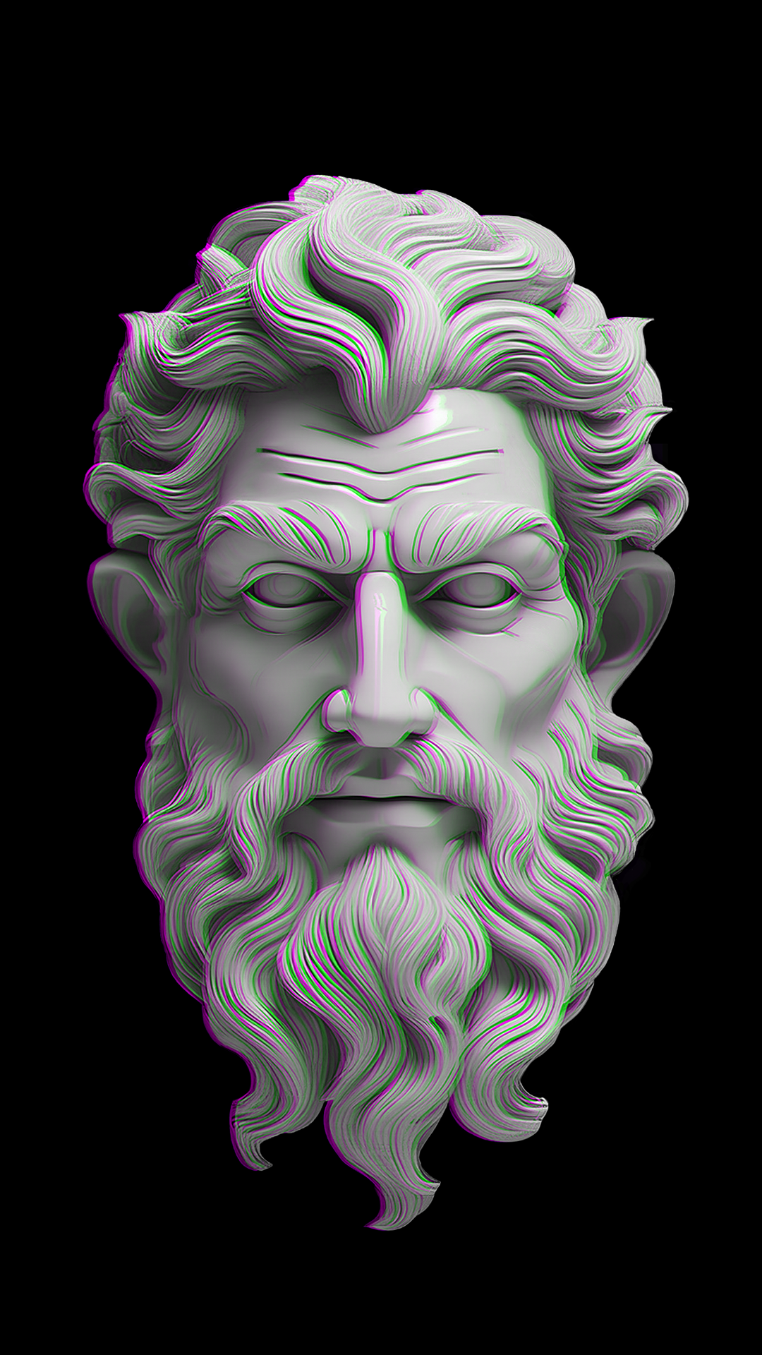
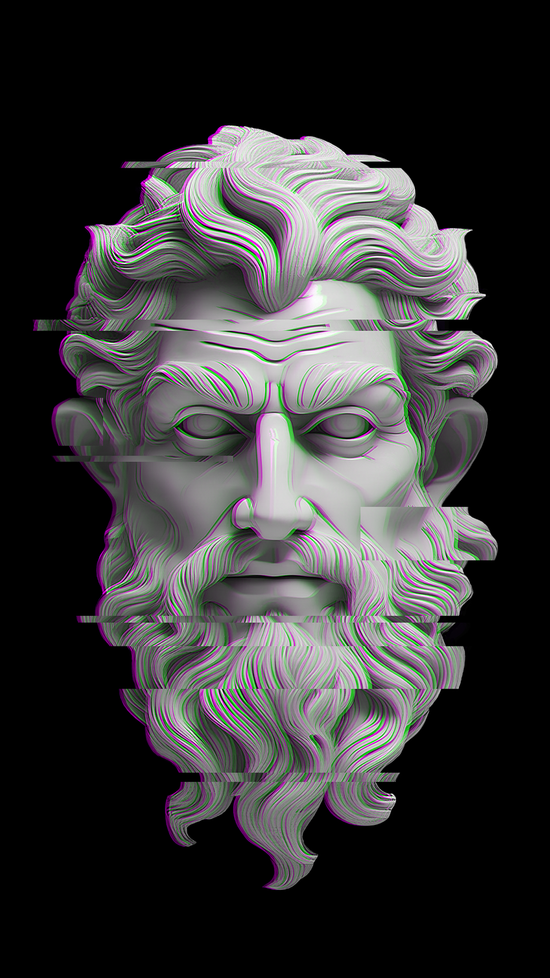
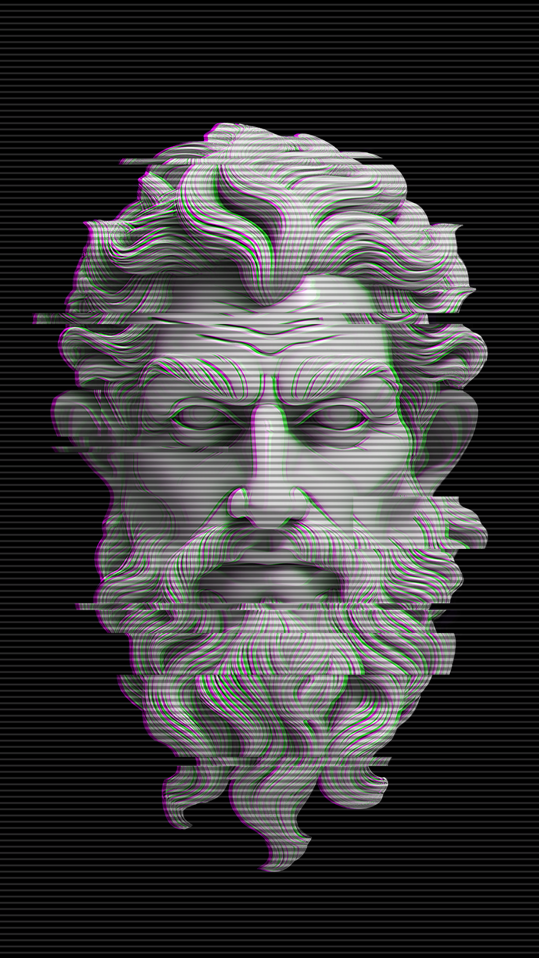
Kronos sculpture created with Adobe Firefly. Each frame is a stage of adding more effects, which make up the final glitch impression. I was really shocked by what Firefly can do, just look at the accuracy of the reproduction. Complete madness.